STACKIT Landing Zone Accelerator
STACKIT
Zuletzt aktualisiert am


Drei Stationen zu deinem ersten Beitrag: ein Profil, das sagt, wer du bist, ein Asset mit deinem Wissen und ein Trail, der deine Assets verbindet.
Ein Profil sagt, wer du bist. Assets tragen, was du weißt. Ein Trail macht daraus eine Journey. Das Studio hilft bei allen dreien.

Dein Profil ist eine Seite mit deinem Namen, deinem Logo und einer kurzen Beschreibung. Sie kommt über einen normalen Pull Request hinein. Jedes Asset von dir verweist darauf zurück.
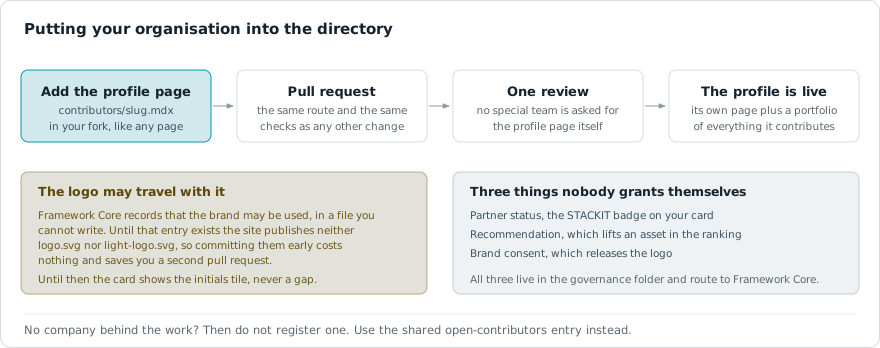
Work in the STACKIT Cloud Framework is attributed to a contributor, and a contributor is a profile page. These profiles control the dynamic rendering inside the interactive SCFContributorExplorer component and establish an explicit link between technical asset containers and the contributing organizations.
That does not mean everyone needs a page of their own. There are two ways in, and the right one depends on whether a company stands behind the work:
open-contributors entry instead of inventing an organization. Nothing else changes: assets and trails are filed under assetcontainer/open-contributors/ exactly as they would be anywhere else, and the same review applies. Because the entry is shared it carries no company mark, and the maintainers block on each page is what credits the individual — name yourself there with user: your.username.Switching later is only a matter of moving the files: register the organization when it appears, and the pages move into its container.
The registration of a new contributor profile requires strict compliance with the STACKIT Cloud Framework repository conventions to protect responsive layouts on mobile screen sizes.
apps/docs/src/content/docs/contributors/[partner-slug].mdxapps/docs/src/content/docs/contributors/[partner-slug]/Each theme carries its own file, and a theme without one shows a placeholder mark instead of borrowing the other. A logo drawn for white paper disappears on our dark surfaces, so we no longer stretch one file across both.
logo.png or logo.svg in the partner-specific subdirectory, 1:1 square aspect ratio. This is the file shown on the dark theme.light-logo.png or light-logo.svg, same folder and format rules. If your mark works on both grounds, supply the same artwork under both names.To guarantee flawless compilation and high semantic visibility for automated Enterprise RAG indexers, follow these strict content design tokens:
description field and aim for 120 to 160 characters: enough to say what the page offers. The card shows all of it. The window is rewarded with a ranking bonus rather than enforced: missing it costs the bonus and nothing else, and the pipeline only warns below 120 or above 180 characters. A missing description, a stub, or a placeholder fails the pipeline.- **Lead term**: Explanation sentence. pattern to enforce HTML definition list rendering.The following block represents a fully compliant reference implementation for a contributor profile. The layout utilizes the centralized <ScfContributorHeader /> component to automatically render brand marks and badges matching design system standards, replacing manual inline styling blocks.
---title: "Mockup Company Inc."description: "Official partner profile of Mockup Company Inc. – Specializing in sovereign cloud consulting, STACKIT infrastructure, and fully automated DevOps pipelines."sidebar:  hidden: true---
<ScfContributorHeader title="Mockup Company Inc." badge="Consulting Partner" />
## Company Profile
Mockup Company Inc. guides organizations through the migration, modernization, and operation of workloads in sovereign cloud environments. As a core contributor to the STACKIT Cloud Framework, Mockup Company Inc. focuses on production-ready enterprise architectures, cloud automation, and compliance-driven cloud-native solutions.
## Consultant Profile
### Key Facts- **Consultant Role**: Senior Cloud Consultant specializing in enterprise architecture.- **Cloud Experience**: More than 4 years of dedicated project engineering experience.- **Schwarz Gruppe History**: 8 years of total group experience including 2 years within the STACKIT ecosystem.- **Academic Education**: Master of Science (M.Sc.) in Media Informatics.
### Technical Core Competencies
#### Cloud Platforms & Managed Services- **STACKIT SKE**: Design, provisioning, and orchestration of production-ready managed Kubernetes clusters.- **STACKIT Cloud Foundry**: Deployment, scaling, and lifecycle management of cloud-native applications.- **Sovereign Cloud Compliance**: Architectural consulting aligned with Schwarz Gruppe governance and security directives.
#### Infrastructure as Code (IaC) & Automation- **Terraform Automation**: Declarative provisioning and versioning of STACKIT resources including projects, networks, compute, and SKE.- **Bash Scripting**: Automation of system processes, OS template preparation, and CI utility scripts.
#### DevOps, CI/CD & Tooling- **Pipelining Engines**: Conception and implementation of robust CI/CD tracks for automated quality assurance and continuous deployment.- **Docker Runtimes**: Construction of standardized container images and configuration of secure container runtimes.- **Git Versioning**: Structured version control utilizing Git-Flow and Trunk-Based Development within distributed engineering teams.Run the docs locally (VS Code task 🥾 Hike — Start Dev Docs, or the hike command in the container terminal, served on http://localhost:4321) and open the interactive playgrounds below. Each renders the component live and documents its configuration options:
showSearch, contributorIds) with default and pre-filtered examples: http://localhost:4321/demo/components/demo-scf-contributor-loaderlogo.png / light-logo.svg brand marks resolve per theme, and what the placeholder looks like when one is missing: http://localhost:4321/demo/components/demo-scf-logosEin Asset ist eine MDX-Seite mit einem kurzen Metadatenblock: ein Titel, eine Beschreibung mit 150 bis 160 Zeichen, eine Kategorie und bis zu 10 Tags. Daraus baut die Seite diese Karte.
The STACKIT Cloud Framework provides a robust, decoupled architecture for discovering, scoring, and rendering technical architecture assets. This guide outlines the pipeline mechanics, data orchestration layers, and interactive state capabilities driving the automated asset discovery components.
To ensure flawless automated ingestion, lifecycle indexing, and strict separation of framework governance, assets must be placed within explicit file system directories.
apps/docs/src/content/docs/[framework]/assetcontainer/[partner-slug]/.All asset configuration blocks must adhere to rigid schema validations to enforce search engine optimization (SEO) targets and robust Large Language Model (LLM) text chunk indexing constraints. Non-compliant files will trigger build-time compilation blocks.
Asset metadata lives under the scfAsset key (mirroring scfTrail for trails). The former name frameworkAsset is still accepted, so existing files keep working; new assets should use scfAsset. Optionally, add a maintainers list to credit who maintains the asset as a point of contact (shown above the git history).
maintainers names the people or organizations who look after this asset and act as its point of contact. It renders as a Maintainers block above the contributor list of the git history. It is a credit, not a permission: it does not restrict who may edit the file. Trails use the identical field under scfTrail.
If you have a STACKIT Git account, name yourself by username and nothing else. That is the whole entry:
scfAsset: maintainers: - user: "jane.doe"Everything else about you lives in one place: settings/contributor-members.json, maintained by Framework Core. It records which contributor organization you belong to, and which of your mirrored profile fields may be shown: your biography as the role line, your website, your address, and your contribution record. That file is the reason an asset cannot decide what is published about you: only the person a field describes can grant it, and a field nobody granted is never even fetched.
Ask Framework Core to add or change your entry. It looks like this:
"jane.doe": { "org": "acme-corp", "show": { "role": true, "website": true, "activity": true }}Your organization comes from there too, which is why you do not write contributor next to a user: nobody should be able to inherit an official partner badge by typing a company name beside their own.
Two things have to exist before anything beyond your name appears. Your entry in the membership file, and the declaration behind it. The declaration is where you state, once, what you release for publication: your brand, your content, and which of your profile details may be shown.
You file it yourself. Open an issue in the content repository and pick the Contributor declaration template, fill it in, and Framework Core or your framework owner records the result in settings/contributor-members.json. Nothing you write in the issue is rendered on the site. It is the record behind what the site is allowed to do.
Until that record exists, the daily pipeline publishes nothing about you, your name included, so the credit reads as an anonymous contributor even when the flags in the membership file are already set. The flags describe what you allow. The declaration is the proof that you allowed it. The pipeline waits for both.
The same route works later. Comment on your own declaration issue to change or withdraw any of it, and ask Framework Core or your framework owner to update your entry. A role: true in an asset does nothing, so there is no way to switch a field on from a content file. That is the point: only the person a field describes can release it.
The pipeline mirrors the profiles once a day and copies only the fields that person allowed: a website, an address or a biography nobody consented to is never fetched and never stored. Your full name is the exception, because it is the name you are credited under. Until your first mirror runs the entry shows your plain username, so a new maintainer is credited immediately rather than showing an empty row. Once mirrored, an empty Full name counts as a choice: the credit then reads “Anonymous contributor” instead of exposing your username. If you would rather keep a recognisable byline without your legal name, set the Full name to a pseudonym, a short form or your initials, and the site shows exactly that.
Every field is optional and they combine freely. An entry only has to carry at least one of user, name, contributor or email, so it is never rendered anonymously, and one asset accepts up to 6 entries.
| Field | Purpose |
|---|---|
user | STACKIT Git username. The lookup key for the mirrored profile, and the fallback label until it has been mirrored. |
role | Sets the role text literally. For people without an account: with a user, the biography from their own profile appears instead, and only if they allowed it. |
website | Sets a URL literally, same rule as role. |
email | Sets an address literally, same rule as role. It renders as its own mail action, so it sits alongside a profile link instead of competing with it. |
name | Overrides the mirrored full name, and credits people who have no Git account at all. It makes the entry a person: initials avatar, role line reading role · organization. |
contributor | Slug of a /contributors/<slug> profile, for people without an account. On its own it credits the organization, using the profile title, its logo initials and its official partner badge. Ignored next to a user, whose organization comes from the membership file. |
link | A profile or homepage URL, typically LinkedIn. It becomes the entry’s own link and takes precedence over both the mirrored website and the contributor profile. |
External partners have no account on the instance, so they are credited with the explicit fields instead:
scfAsset: maintainers: - name: "John Smith" role: "Platform Engineer" contributor: "acme-corp" email: "john.smith@example.com" link: "https://www.linkedin.com/in/john-smith/" - contributor: "acme-corp" role: "Managed service"The category field within the scfAsset configuration block only accepts one of these twelve predefined system enumerations. Any other value fails the build:
| Category | Purpose |
|---|---|
generic | Fallback for assets that fit no specific category. |
blueprint | Reference architectures and solution designs. |
guide | High-level overviews or step-by-step installation instructions. |
code-snippet | Reusable code parts (Terraform, YAML, CLI). |
policy | Governance, security rules, and compliance templates. |
video | Visual product demonstrations or webinars. |
workshop | Materials for discovery, planning, or migration workshops. |
case-study | Success stories and real-world implementation examples. |
whitepaper | Strategic concepts and deep technical research. |
service | Professional or managed offerings (consulting, support, operations). |
software | Ready-to-use applications, platform extensions, or tools. |
runbook | Step-by-step preparation, execution, validation, and rollback instructions. |
Use this compliant metadata template when authoring or onboarding new technical documentation assets into an active workspace container:
---title: "Compliant Asset Title"# The description below is 150 characters: inside the rewarded window. Write your# own summary of the page - the pipeline rejects placeholders and any description# that quotes the length rule instead of describing the asset.description: "Reference architecture for automated landing zone provisioning on STACKIT, covering network segmentation, IAM guardrails, and Terraform module layout."scfAsset: managed: true # Required as soon as managed is true: the Marketplace entry this asset can be # booked from. It has to be a marketplace.stackit.cloud address, the card renders # no pill for anything else. No entry yet? Write # https://marketplace.stackit.cloud/en/products as a stand-in. It holds for 7 days # from the day this file is added; after that the weekly sweep tags the asset # "wip" and it drops out of the default listing until somebody links the entry. marketplaceUrl: "https://marketplace.stackit.cloud/en/products/<entry>" category: "blueprint" # Up to 10 tags, each at most 20 characters. Both limits are hard. tags: ["cloud", "automation", "security"] # Optional: credit the maintainers (shown as a point of contact). maintainers: - name: "Jane Doe" role: "Cloud Architect" # Optional: show a product logo instead of the contributor logo. Looks for # this file in the contributor folder (contributors/<owner>/product.png) and # for a light-product.png sibling next to it. Supply both, one per theme, the # same way the contributor logo works. Without the light variant the card # falls back to the contributor logo there and shows two different brands # depending on the theme. # productLogo: "product.png"---<LinkCard> and <LinkChip>Every reference that stands on its own must say where it leads before anyone clicks it. Two components do that, and the PR pipeline blocks a bare markdown link on its own line in the files your PR touches:
<LinkCard> is a standalone panel for a reference that carries its own weight: the closing card at the end of an asset pointing to the repository or primary source, or a reference sitting under its own heading.<LinkChip> is a compact inline pill for a link that is a line of its own inside a list — a bullet that is only a link, or a **Label**: followed by one.<LinkCard title="Terraform Provider Documentation" href="https://registry.terraform.io/providers/stackitcloud/stackit/latest/docs" />
- **Runbook**: <LinkChip href="/migration/migrate/">Migration execution phase</LinkChip>Rules worth knowing:
check-link-cards.mjs only checks the shape of the links you do write, so an open asset that documents everything in place is complete without any outbound link. The one hard link requirement lives in the frontmatter, not the body: a managed asset must carry marketplaceUrl, and it has 7 days from the day it is added before the weekly sweep tags it wip for still standing on the placeholder. See the blueprint above.href automatically — STACKIT portal, marketplace, documentation, code hosting, or third party — and a third-party destination is visibly marked as leading off the trail. There is no prop to override this, so a label can never lie about the destination.#anchors are navigation, not destinations.<ScfStackitExcerpt>Limits, plans, versions and model lists change on the STACKIT side. Do not copy them by hand. Point to the section of the STACKIT documentation instead. The page then shows it in a frame with its source and date. A scheduled run fetches every section four times a day, so the page stays current without anyone editing it.
<ScfStackitExcerpt href="https://docs.stackit.cloud/products/storage/file-storage/basics/limits/#general-limits" />https://docs.stackit.cloud/products/, with the #anchor of the heading where the section starts. The section runs to the next heading of the same level. The German page finds its German section by itself.<LinkCard>.view="facts" profile="model-serving" shows the shared models of AI Model Serving as one table. It is the only profile today.Run hike, summit or patrol as usual. New excerpts in your files are fetched for the preview and show the note “Local preview, not checked yet”. A wrong anchor is named in the terminal before the build, together with the anchors the page really has:
📄 STACKIT excerpts: 2 request(s) for new references. What arrived shows "not checked yet" until the merge. /products/messaging/mailout/basics/resource-limits/#limits: no heading with this anchor. Anchors on that page: resource-limits, message-limits, sending-quota, object-resource-limitsThe preview needs access to docs.stackit.cloud. Without it the build goes on and shows a placeholder. The preview of your pull request also shows a placeholder. After the merge the published page shows the section on the same day.
The explorer interface utilizes real-time history synchronization to ensure shared browser addresses act as immutable, reproducible application layouts. The state parameters are actively tracked:
search query parameter.framework query parameter.asset parameter to the address bar.To implement the standardized discovery layout on an architectural landing view, utilize the sequential integration workflow.
Import the Execution Loader: Open the target page layout file and reference the authoritative build-time ingestion container directly.
import ScfAssetLoader from '@components/scf/scf-asset-loader.astro';Mount the Interface Node: Embed the component tag inside the markup block. Pass an optional layout scoping value to lock the default interface view to a specific category.
<ScfAssetLoader frameworkSlug="migration"/>Verify Local Compilations: Validate the environment to ensure that the browser parameter tracking and history hooks operate flawlessly without generating compilation warnings.
Run the docs locally (VS Code task 🥾 Hike — Start Dev Docs, or the hike command in the container terminal, served on http://localhost:4321) and open the interactive playgrounds below. Each page renders the component live and walks through every available configuration option, so it doubles as the authoritative reference for the props you can pass:
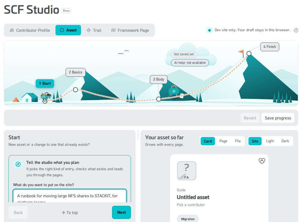
frameworkSlug, showFilter, showSearch, assetIds, filterByTag, filterTagMode) with copy-paste examples for the global, curated, multi-tag (filterByTag takes one tag or an array to OR together; filterTagMode="all" requires all), and framework-filtered use cases: http://localhost:4321/demo/components/demo-scf-loaderhttp://localhost:4321/demo/components/demo-scf-explorerhttp://localhost:4321/demo/components/demo-scf-cardscf-core.png fallback: http://localhost:4321/demo/components/demo-scf-logosDu füllst ein Formular aus. Das SCF Studio prüft jedes Feld schon beim Tippen und öffnet den Pull Request für dich. Es lädt auch eine bestehende Seite und ändert nur, was du bearbeitest.
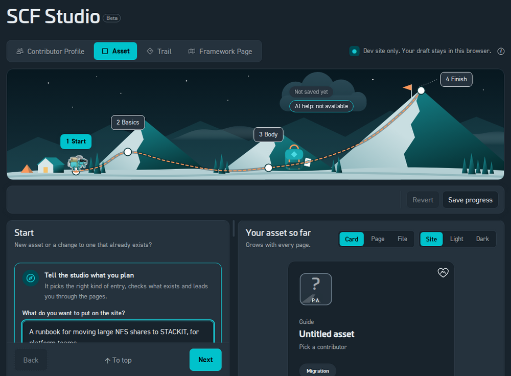
Ein Trail ist eine Liste von Schritten. Jeder Schritt zeigt auf ein Asset, eine Seite oder einen Abschnitt daraus. Mit einem Bild oder einer zweiten Spalte wirkt er auch als Folie.
Mapping out comprehensive migration paths connects scattered individual pieces into a single unified workspace experience. The core layout engine interprets structured parameters to build interactive timeline tracks for developers.
For the system to automatically detect and register a journey path, your documents must follow precise workspace file paths.
apps/docs/src/content/docs/[framework-slug]/trails/[contributor-slug]/[trail-slug].mdxscfTrail key. If this entry is missing, the indexing loader will automatically skip the document to ensure work-in-progress content stays hidden.scfTrail.tags (max 20 characters each) to make the trail discoverable. The card shows the first few plus a +N chip; every tag is searchable in the trail explorer.style enum)Each timeline step accepts an optional style key that tags the milestone with its journey stage. These are the values validated by the content schema:
| Style Key | Milestone Stage |
|---|---|
compass | PLAN — strategic alignment, assessments, and migration discovery analysis. |
hut | BASE — baseline environment setup and prerequisites. |
stairs | STEP — core engineering requirements and platform maturity. |
t-bar | LIFT (low) — incremental enablement of capabilities. |
chairlift | LIFT (mid) — scaling capabilities across teams. |
gondola | AUTO — continuous delivery and automated workflow execution pipelines. |
shield | SAFE — governance validation, security baselines, and C5 compliance tracking. |
crevasse | WARN — risks, pitfalls, and remediation checkpoints. |
chart | OPS — observability, cost, and operational steering. |
rocket | LIVE — production launches and go-live milestones. |
summit | GOAL — milestone completion, handover, and monitoring. |
The style value is optional. Steps without it still render correctly.
Timeline items can contain either custom descriptions or dynamic links to framework documents.
Perfect for steps that describe a high-level concept or phase where no physical code repository exists yet. Authors supply a custom title and a description field manually.
Points directly to a dynamic codebase example or pattern via its standard Astro ID. The core parser fetches the asset information, handles the creator data, and displays an interactive SCFAssetCard right on the milestone timeline track. Append an optional #section-anchor to the assetId to embed only that section of the asset instead of the whole document, exactly like the page references below (for example .../assetcontainer/stackit/howto-contributors#directory-structure--asset-placement).
Links a regular framework page (not an asset) via its pageId. The step renders an interactive SCFPageCard and embeds the page content directly in the timeline. Append an optional #section-anchor to render only that section of the page instead of the whole document, for example migration/migrate/#core-modules-in-this-phase.
role)Long trails often walk through several sections of the same source, and repeating the full step header (stage marker + asset card + contributor card) for each one buries the timeline. Give such a step role: sub and it nests as a compact, lettered row (a, b, …) under the nearest preceding main step — just its title and a one-line context, no stage marker and no cards. Steps default to role: main, so existing trails are unchanged.
sub with no preceding main is treated as a main step.assetId / pageId than its main step, a small source chip appears in the row and a slim source banner (logo · title · contributor · category · open link) is shown above its content, so the reader always knows where the content comes from. Same source as the parent = nothing extra.role is also the default agenda role when the trail is presented (see the Presentation guide), so sub steps come through as indented sub-points without extra work.- style: "stairs" title: "Provision the Landing Zone" assetId: "migration/assetcontainer/stackit/landing-zone-foundation-opentofu" trailContext: "The accelerator provisions the baseline. The next rows walk its layers."- role: "sub" title: "Module-by-module breakdown" assetId: "migration/assetcontainer/stackit/landing-zone-foundation-opentofu#module-by-module-breakdown" trailContext: "Governance, connectivity and DevOps: what each module provisions."- role: "sub" title: "Account governance" pageId: "migration/design-and-mobilize/design/account-governance" trailContext: "A different source, so this row shows a source banner."A step can carry a figure. In the timeline it appears under the step; in the presentation it becomes the slide’s second column, or a full-width cover. Two fields control the layout in both cases:
imagePosition: leave it out and the picture is centered — a cover that spans the slide under the title, with the step text following underneath (full says the same thing explicitly). right or left puts the picture beside the text instead.imageWidth: the picture column’s width in percent for left / right (20–70, default 45). Ignored for centered covers.Both fields are optional, so existing trails keep working unchanged.
The other column is whatever the step already shows as its content — you choose it with the fields you know: a trailContext paragraph, an asset section via assetId with a #section-anchor, or a page section via pageId with a #section-anchor. So “image on the right, an asset section on the left” is just both fields on one step:
- style: "gondola" title: "Run the Migrate Phase" pageId: "migration/migrate/#core-modules-in-this-phase" imageSrc: "migration/design-and-mobilize/security-and-compliance/files/security-and-compliance-overview-map-en.svg" imageAlt: "Security topics that accompany the Migrate phase" imagePosition: right imageWidth: 40The picture itself is named with imageSrc, a path relative to the content root, so you can keep the file next to your trail:
- style: "shield" title: "Anchor Security and Compliance Early" trailContext: "The topic map below shows what has to be in place before the first workload moves." imageSrc: "migration/design-and-mobilize/security-and-compliance/files/security-and-compliance-overview-map-en.svg" imageAlt: "Security and compliance topic map" imagePosition: fullimageAlt is both the alt text and the caption. Only pictures on this site are allowed — a path starting with / works too, but external http(s) addresses are ignored on purpose. Animated SVGs work: whatever animation is baked into the file plays in the timeline and on the slide.
left / right / center)The picture fields above are the shortcut for “one content plus one image”. For full control over both sides, a step can place any content type into named slots — not just images. Each of left, right and center holds exactly one thing:
text: "…" — free proseassetId: "…" — an asset card (a pointer). Add a #section-anchor to embed just that one section instead (the card is hidden by default; add cards: true to keep it).pageId: "…" — a page card (a pointer). Add a #section-anchor to embed just that one section instead (the card is hidden by default; add cards: true to keep it).trailId: "…" — a trail card (a pointer to another trail).imageSrc: "…" (+ imageAlt) — a figure (click to zoom)Card = pointer, #anchor = content. This is the key rule for columns: a bare assetId / pageId / trailId renders only the card — a compact pointer that says “here is the thing”. When you want the reader to actually see some of that content in the column, add a #section-anchor to an assetId or pageId, and exactly that one section is embedded on its own — the card is hidden by default so the column shows just the section (a compact origin breadcrumb Framework › Title stands in, so the reader still sees where it comes from). Trail cards are always pointers (a trail has no sections to embed). A whole asset or page body is too tall for a column — if you want the full content in the deck, reference it as a flat step (assetId / pageId at the step level, not in a column) instead.
Showing the card with cards: true. Because a step that stacks several sections of the same source would otherwise repeat that card in front of every one of them, a section column drops the card by default. When you do want the pointer card above the section, set cards: true on the column and it appears above the embedded content. The flag only matters when the column carries a section; a bare pointer always keeps its card so it never renders as an empty column.
Several items in one slot. left, right and center each also accept a list. The items stack in the given order inside that column, separated by a thin divider, and they can come from different sources: three sections of one asset on the left, two pages on the right.
Where each slot renders:
| Frontmatter | Layout |
|---|---|
left: + right: | two columns side by side (split) |
left: only | that content in the left half, left-aligned |
right: only | that content in the right half, right-aligned |
center: | that content centered as a cover |
| none of these | the step renders exactly as before (backward compatible) |
Under ~900px the columns stack. For a split, splitRatio sets the left column’s width in percent (10–90, default 50). The timeline and the presentation slide use the same layout, so what you compose here is what the deck shows.
# split: a page section on the left, an asset on the right, 55/45- style: "stairs"  title: "Decision, then the tool that implements it"  splitRatio: 55  left:    pageId: "migration/design-and-mobilize/design/overview/#decision-criteria-by-r-strategy"  right:    assetId: "migration/assetcontainer/stackit/landing-zone-foundation-opentofu"
# text on the left, a figure on the right- style: "shield"  title: "Anchor Security Early"  left:    text: "Map the control topics before the first workload moves, not in the audit."  right:    imageSrc: "migration/design-and-mobilize/security-and-compliance/files/security-and-compliance-overview-map-en.svg"    imageAlt: "Security and compliance topic map"
# center: a single cover figure (or centered text)- style: "chart"  title: "The Whole Terrain"  center:    imageSrc: "advisory/trails/stackit/getting_started/map-overview.svg"    imageAlt: "Framework overview map"
# several sections in one column: cards hidden by default, each under an origin breadcrumb- style: "stairs" title: "Three Steps of the Same Runbook" splitRatio: 60 left: - assetId: "migration/assetcontainer/stackit/landing-zone-foundation-opentofu/#overview" - assetId: "migration/assetcontainer/stackit/landing-zone-foundation-opentofu/#deployment-flavours-and-what-they-enable" right: text: "Each section keeps its origin breadcrumb, so the reader can tell the three apart without three identical cards. Add cards: true to a column if you do want its pointer card shown."alternatives)Sometimes one stage of a journey has several equally valid ways to walk it: migrating the VMs with the standard guide, with a live-migration tool or with a replication tool. Without alternatives you would either build three steps for one decision or leave the alternatives out. With alternatives the step stays one waypoint (one title, one stage marker, one agenda entry) and carries several tracks the reader can switch between.
assetId / pageId (or, with neither, its trailContext text) is the default track. Nothing changes for existing trails: alternatives is purely additive.id (deep links and presentation views key on it) and carries exactly one of the three content kinds a flat step can carry: an assetId, a pageId (both may take a #section-anchor) or, with neither, plain text from label + trailContext.label is the name shown in the chooser; for asset and page tracks it falls back to the referenced title.trailContext replaces the step’s for that track. It is also that track’s speaker note in the presentation.role: sub) and column steps (left / right / center) do not support alternatives; the validator tells you if you try.On the page the step renders its active track exactly like a normal step, with the track’s own asset and contributor cards. A quiet line under the cards (“2 alternatives for this step”) opens the chooser; picking a track swaps the cards and content in place. The choice lands in the URL as ?alt=<step-id>:<alternative-id> (comma-separated across steps), so a link can share a specific route — give alternative steps an explicit step id for that. “Copy for AI” always exports the track that is currently shown and names the alternatives.
In the presentation the launch screen offers a track select per alternative step (defaulting to whatever the page has active), and a prepared view can pin a track via alternative: on its step reference — see the presentation guide below.
- style: "stairs" id: "migrate-vms" title: "Migrate the Virtual Machines" trailContext: "Move the compute layer in waves. Pick the alternative that matches your downtime budget." assetId: "migration/assetcontainer/stackit/migration-asset" alternatives: - id: "hystax" label: "Live migration with Hystax Acura" assetId: "migration/assetcontainer/hystax/hystax-acura-live-migration" trailContext: "For near-zero downtime windows." - id: "coriolis" assetId: "migration/assetcontainer/cloudbase/cloudbase-coriolis" - id: "manual" label: "Manual wave migration" trailContext: "Plan and execute the waves by hand with the runbooks."Copy this metadata configuration layout as a baseline template when creating a new framework tracking timeline. Optionally add a maintainers list under scfTrail to credit who maintains the trail as a point of contact (shown above the git history), the same field assets use:
If you have a STACKIT Git account, name yourself by username and nothing else — that is the whole entry:
scfTrail: maintainers: - user: "jane.doe"| Field | Purpose |
|---|---|
user | STACKIT Git username. The lookup key for the mirrored profile, and the fallback label until it has been mirrored. |
role | Sets the role text literally. For people without an account: with a user, the biography from their own profile appears instead, and only if they allowed it. |
website | Sets a URL literally, same rule as role. |
email | Sets an address literally, same rule as role. It renders as its own mail action, so it sits alongside a profile link instead of competing with it. |
name | Overrides the mirrored full name, and credits people who have no Git account. It makes the entry a person: initials avatar, role line reading role · organization. |
contributor | Slug of a /contributors/<slug> profile, for people without an account. On its own it credits the organization, using the profile title, its logo initials and its official partner badge. Ignored next to a user, whose organization comes from the membership file. |
link | A profile or homepage URL, typically LinkedIn. It takes precedence over both the mirrored website and the contributor profile. |
Every field is optional and they combine freely; an entry only has to carry at least one of user, name, contributor or email, and one trail accepts up to 6 entries. Keys the schema does not know are dropped without an error, so a typo leaves the build green and renders nothing. Maintainers are a credit, not a permission: the list does not restrict who may edit the trail. The asset integration guide carries the same fields with an example for external partners.
---title: "Standard Kubernetes Onboarding Track"description: "A comprehensive guided journey trail directing engineering workloads from legacy virtualization targets into sovereign managed STACKIT clusters."scfTrail:  # Optional: credit the maintainers (shown as a point of contact above the git history).  maintainers:    - name: "Jane Doe"      role: "Trail Owner"  steps:    - style: "compass"      title: "Initial Assessment Phase"      trailContext: "Analyze workload traits and infrastructure requirements before initializing resources."
    - style: "gondola"      assetId: "migration/assetcontainer/stackit/landing-zone-foundation-opentofu"      trailContext: "Deploy the landing zone automated profile using standardized infrastructure code scripts."
    - style: "stairs"      title: "Execute the Migration Modules"      trailContext: "Work through the core migration modules; the optional #anchor renders only that page section."      pageId: "migration/migrate/#core-modules-in-this-phase"
- style: "summit" title: "Final Cluster Validation" description: "Review compliance policies and confirm that all configuration checks pass security rules."---A trail file itself is frontmatter-only, so the link rule never touches it: text in trailContext and column text renders as plain text, links included. It does apply to the asset and content pages your steps point at: there, every reference that stands on its own line must be a <LinkCard> or <LinkChip>, both auto-imported, both deriving their kind (portal, marketplace, documentation, code, third party) from the URL alone. The PR pipeline blocks bare standalone links in changed files and verifies that on-site card and chip targets exist. The full rule lives in the asset integration guide.
Every trail can be opened as a slide deck from the presentation button on its detail view — no extra frontmatter required. As the author you can also predefine prepared views (curated slide selections), preset the launch behaviour, and turn a step’s figure into a split slide. All of that lives in a presentations block under scfTrail and is documented in its own guide: the Presentation guide.
To compose a trail without writing YAML by hand, use the SCF Studio. Start the docs (hike) and open /studio in your dev container, or use it on the dev site. It builds the steps, resolves every asset and page you point at, and it can load an existing trail and change only what you edit.
Run the docs locally (VS Code task 🥾 Hike — Start Dev Docs, or the hike command in the container terminal, served on http://localhost:4321) and open the interactive playgrounds below to see the trail components rendered live:
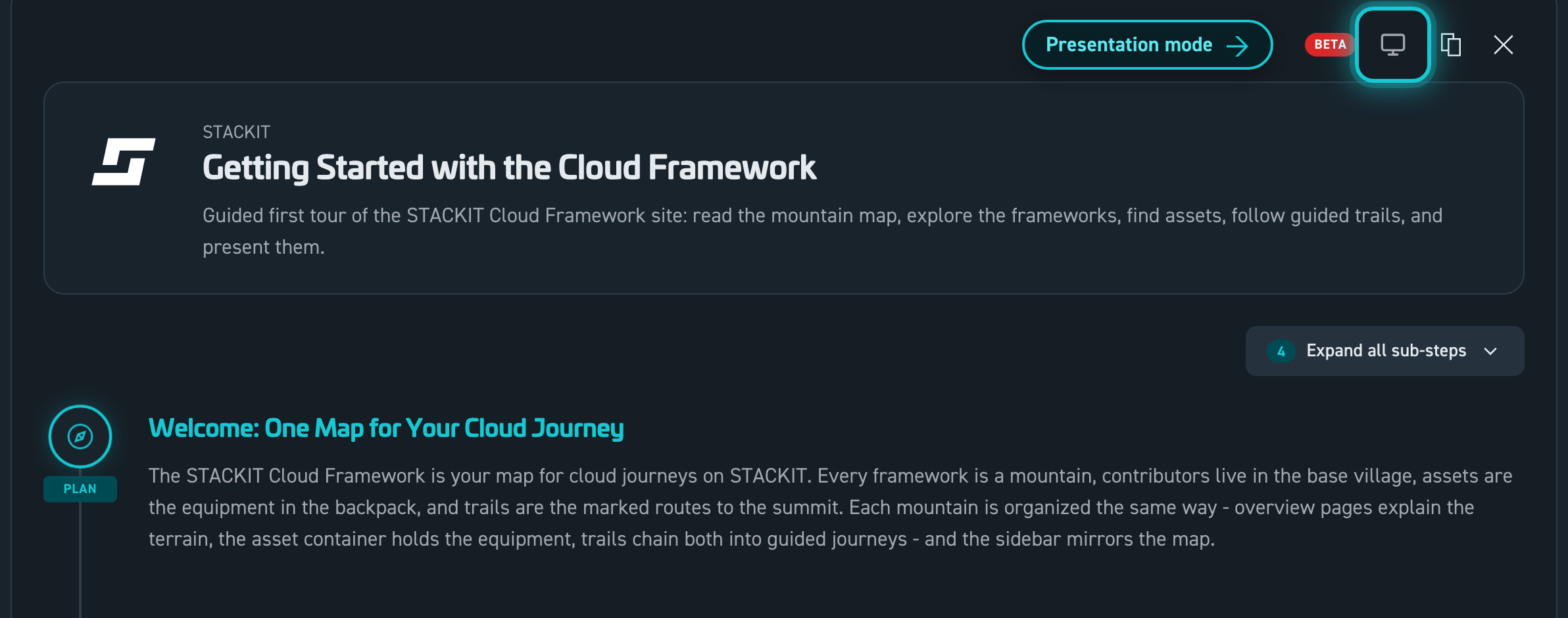
<ScfTrailLoader />, including the inline detail view: http://localhost:4321/demo/components/demo-scf-trail-loaderstyle, assetId, title, and trailContext handling: http://localhost:4321/demo/components/demo-scf-trailKlicke auf Präsentieren, und der Trail läuft als Deck: am Beamer, mit einem Klicker oder am Handy. Du siehst gerade eines.
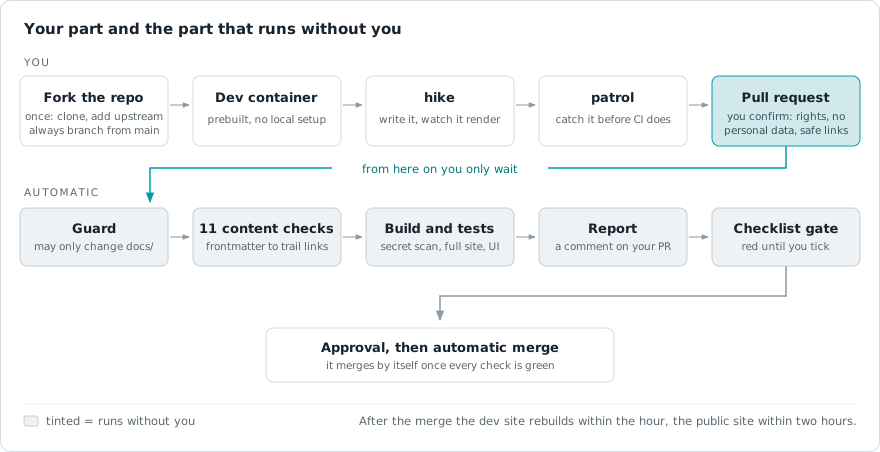
Setze im Pull Request den Haken für den automatischen Merge. Prüfungen, eine Vorschauseite für das Review und der Merge laufen dann ohne dich. Die öffentliche Seite zeigt die Änderung innerhalb von zwei Stunden.
Mapping out comprehensive migration paths connects scattered individual pieces into a single unified workspace experience. The core layout engine interprets structured parameters to build interactive timeline tracks for developers.
For the system to automatically detect and register a journey path, your documents must follow precise workspace file paths.
apps/docs/src/content/docs/[framework-slug]/trails/[contributor-slug]/[trail-slug].mdxscfTrail key. If this entry is missing, the indexing loader will automatically skip the document to ensure work-in-progress content stays hidden.scfTrail.tags (max 20 characters each) to make the trail discoverable. The card shows the first few plus a +N chip; every tag is searchable in the trail explorer.style enum)Each timeline step accepts an optional style key that tags the milestone with its journey stage. These are the values validated by the content schema:
| Style Key | Milestone Stage |
|---|---|
compass | PLAN — strategic alignment, assessments, and migration discovery analysis. |
hut | BASE — baseline environment setup and prerequisites. |
stairs | STEP — core engineering requirements and platform maturity. |
t-bar | LIFT (low) — incremental enablement of capabilities. |
chairlift | LIFT (mid) — scaling capabilities across teams. |
gondola | AUTO — continuous delivery and automated workflow execution pipelines. |
shield | SAFE — governance validation, security baselines, and C5 compliance tracking. |
crevasse | WARN — risks, pitfalls, and remediation checkpoints. |
chart | OPS — observability, cost, and operational steering. |
rocket | LIVE — production launches and go-live milestones. |
summit | GOAL — milestone completion, handover, and monitoring. |
The style value is optional. Steps without it still render correctly.
Timeline items can contain either custom descriptions or dynamic links to framework documents.
Perfect for steps that describe a high-level concept or phase where no physical code repository exists yet. Authors supply a custom title and a description field manually.
Points directly to a dynamic codebase example or pattern via its standard Astro ID. The core parser fetches the asset information, handles the creator data, and displays an interactive SCFAssetCard right on the milestone timeline track. Append an optional #section-anchor to the assetId to embed only that section of the asset instead of the whole document, exactly like the page references below (for example .../assetcontainer/stackit/howto-contributors#directory-structure--asset-placement).
Links a regular framework page (not an asset) via its pageId. The step renders an interactive SCFPageCard and embeds the page content directly in the timeline. Append an optional #section-anchor to render only that section of the page instead of the whole document, for example migration/migrate/#core-modules-in-this-phase.
role)Long trails often walk through several sections of the same source, and repeating the full step header (stage marker + asset card + contributor card) for each one buries the timeline. Give such a step role: sub and it nests as a compact, lettered row (a, b, …) under the nearest preceding main step — just its title and a one-line context, no stage marker and no cards. Steps default to role: main, so existing trails are unchanged.
sub with no preceding main is treated as a main step.assetId / pageId than its main step, a small source chip appears in the row and a slim source banner (logo · title · contributor · category · open link) is shown above its content, so the reader always knows where the content comes from. Same source as the parent = nothing extra.role is also the default agenda role when the trail is presented (see the Presentation guide), so sub steps come through as indented sub-points without extra work.- style: "stairs" title: "Provision the Landing Zone" assetId: "migration/assetcontainer/stackit/landing-zone-foundation-opentofu" trailContext: "The accelerator provisions the baseline. The next rows walk its layers."- role: "sub" title: "Module-by-module breakdown" assetId: "migration/assetcontainer/stackit/landing-zone-foundation-opentofu#module-by-module-breakdown" trailContext: "Governance, connectivity and DevOps: what each module provisions."- role: "sub" title: "Account governance" pageId: "migration/design-and-mobilize/design/account-governance" trailContext: "A different source, so this row shows a source banner."A step can carry a figure. In the timeline it appears under the step; in the presentation it becomes the slide’s second column, or a full-width cover. Two fields control the layout in both cases:
imagePosition: leave it out and the picture is centered — a cover that spans the slide under the title, with the step text following underneath (full says the same thing explicitly). right or left puts the picture beside the text instead.imageWidth: the picture column’s width in percent for left / right (20–70, default 45). Ignored for centered covers.Both fields are optional, so existing trails keep working unchanged.
The other column is whatever the step already shows as its content — you choose it with the fields you know: a trailContext paragraph, an asset section via assetId with a #section-anchor, or a page section via pageId with a #section-anchor. So “image on the right, an asset section on the left” is just both fields on one step:
- style: "gondola" title: "Run the Migrate Phase" pageId: "migration/migrate/#core-modules-in-this-phase" imageSrc: "migration/design-and-mobilize/security-and-compliance/files/security-and-compliance-overview-map-en.svg" imageAlt: "Security topics that accompany the Migrate phase" imagePosition: right imageWidth: 40The picture itself is named with imageSrc, a path relative to the content root, so you can keep the file next to your trail:
- style: "shield" title: "Anchor Security and Compliance Early" trailContext: "The topic map below shows what has to be in place before the first workload moves." imageSrc: "migration/design-and-mobilize/security-and-compliance/files/security-and-compliance-overview-map-en.svg" imageAlt: "Security and compliance topic map" imagePosition: fullimageAlt is both the alt text and the caption. Only pictures on this site are allowed — a path starting with / works too, but external http(s) addresses are ignored on purpose. Animated SVGs work: whatever animation is baked into the file plays in the timeline and on the slide.
left / right / center)The picture fields above are the shortcut for “one content plus one image”. For full control over both sides, a step can place any content type into named slots — not just images. Each of left, right and center holds exactly one thing:
text: "…" — free proseassetId: "…" — an asset card (a pointer). Add a #section-anchor to embed just that one section instead (the card is hidden by default; add cards: true to keep it).pageId: "…" — a page card (a pointer). Add a #section-anchor to embed just that one section instead (the card is hidden by default; add cards: true to keep it).trailId: "…" — a trail card (a pointer to another trail).imageSrc: "…" (+ imageAlt) — a figure (click to zoom)Card = pointer, #anchor = content. This is the key rule for columns: a bare assetId / pageId / trailId renders only the card — a compact pointer that says “here is the thing”. When you want the reader to actually see some of that content in the column, add a #section-anchor to an assetId or pageId, and exactly that one section is embedded on its own — the card is hidden by default so the column shows just the section (a compact origin breadcrumb Framework › Title stands in, so the reader still sees where it comes from). Trail cards are always pointers (a trail has no sections to embed). A whole asset or page body is too tall for a column — if you want the full content in the deck, reference it as a flat step (assetId / pageId at the step level, not in a column) instead.
Showing the card with cards: true. Because a step that stacks several sections of the same source would otherwise repeat that card in front of every one of them, a section column drops the card by default. When you do want the pointer card above the section, set cards: true on the column and it appears above the embedded content. The flag only matters when the column carries a section; a bare pointer always keeps its card so it never renders as an empty column.
Several items in one slot. left, right and center each also accept a list. The items stack in the given order inside that column, separated by a thin divider, and they can come from different sources: three sections of one asset on the left, two pages on the right.
Where each slot renders:
| Frontmatter | Layout |
|---|---|
left: + right: | two columns side by side (split) |
left: only | that content in the left half, left-aligned |
right: only | that content in the right half, right-aligned |
center: | that content centered as a cover |
| none of these | the step renders exactly as before (backward compatible) |
Under ~900px the columns stack. For a split, splitRatio sets the left column’s width in percent (10–90, default 50). The timeline and the presentation slide use the same layout, so what you compose here is what the deck shows.
# split: a page section on the left, an asset on the right, 55/45- style: "stairs"  title: "Decision, then the tool that implements it"  splitRatio: 55  left:    pageId: "migration/design-and-mobilize/design/overview/#decision-criteria-by-r-strategy"  right:    assetId: "migration/assetcontainer/stackit/landing-zone-foundation-opentofu"
# text on the left, a figure on the right- style: "shield"  title: "Anchor Security Early"  left:    text: "Map the control topics before the first workload moves, not in the audit."  right:    imageSrc: "migration/design-and-mobilize/security-and-compliance/files/security-and-compliance-overview-map-en.svg"    imageAlt: "Security and compliance topic map"
# center: a single cover figure (or centered text)- style: "chart"  title: "The Whole Terrain"  center:    imageSrc: "advisory/trails/stackit/getting_started/map-overview.svg"    imageAlt: "Framework overview map"
# several sections in one column: cards hidden by default, each under an origin breadcrumb- style: "stairs" title: "Three Steps of the Same Runbook" splitRatio: 60 left: - assetId: "migration/assetcontainer/stackit/landing-zone-foundation-opentofu/#overview" - assetId: "migration/assetcontainer/stackit/landing-zone-foundation-opentofu/#deployment-flavours-and-what-they-enable" right: text: "Each section keeps its origin breadcrumb, so the reader can tell the three apart without three identical cards. Add cards: true to a column if you do want its pointer card shown."alternatives)Sometimes one stage of a journey has several equally valid ways to walk it: migrating the VMs with the standard guide, with a live-migration tool or with a replication tool. Without alternatives you would either build three steps for one decision or leave the alternatives out. With alternatives the step stays one waypoint (one title, one stage marker, one agenda entry) and carries several tracks the reader can switch between.
assetId / pageId (or, with neither, its trailContext text) is the default track. Nothing changes for existing trails: alternatives is purely additive.id (deep links and presentation views key on it) and carries exactly one of the three content kinds a flat step can carry: an assetId, a pageId (both may take a #section-anchor) or, with neither, plain text from label + trailContext.label is the name shown in the chooser; for asset and page tracks it falls back to the referenced title.trailContext replaces the step’s for that track. It is also that track’s speaker note in the presentation.role: sub) and column steps (left / right / center) do not support alternatives; the validator tells you if you try.On the page the step renders its active track exactly like a normal step, with the track’s own asset and contributor cards. A quiet line under the cards (“2 alternatives for this step”) opens the chooser; picking a track swaps the cards and content in place. The choice lands in the URL as ?alt=<step-id>:<alternative-id> (comma-separated across steps), so a link can share a specific route — give alternative steps an explicit step id for that. “Copy for AI” always exports the track that is currently shown and names the alternatives.
In the presentation the launch screen offers a track select per alternative step (defaulting to whatever the page has active), and a prepared view can pin a track via alternative: on its step reference — see the presentation guide below.
- style: "stairs" id: "migrate-vms" title: "Migrate the Virtual Machines" trailContext: "Move the compute layer in waves. Pick the alternative that matches your downtime budget." assetId: "migration/assetcontainer/stackit/migration-asset" alternatives: - id: "hystax" label: "Live migration with Hystax Acura" assetId: "migration/assetcontainer/hystax/hystax-acura-live-migration" trailContext: "For near-zero downtime windows." - id: "coriolis" assetId: "migration/assetcontainer/cloudbase/cloudbase-coriolis" - id: "manual" label: "Manual wave migration" trailContext: "Plan and execute the waves by hand with the runbooks."Copy this metadata configuration layout as a baseline template when creating a new framework tracking timeline. Optionally add a maintainers list under scfTrail to credit who maintains the trail as a point of contact (shown above the git history), the same field assets use:
If you have a STACKIT Git account, name yourself by username and nothing else — that is the whole entry:
scfTrail: maintainers: - user: "jane.doe"| Field | Purpose |
|---|---|
user | STACKIT Git username. The lookup key for the mirrored profile, and the fallback label until it has been mirrored. |
role | Sets the role text literally. For people without an account: with a user, the biography from their own profile appears instead, and only if they allowed it. |
website | Sets a URL literally, same rule as role. |
email | Sets an address literally, same rule as role. It renders as its own mail action, so it sits alongside a profile link instead of competing with it. |
name | Overrides the mirrored full name, and credits people who have no Git account. It makes the entry a person: initials avatar, role line reading role · organization. |
contributor | Slug of a /contributors/<slug> profile, for people without an account. On its own it credits the organization, using the profile title, its logo initials and its official partner badge. Ignored next to a user, whose organization comes from the membership file. |
link | A profile or homepage URL, typically LinkedIn. It takes precedence over both the mirrored website and the contributor profile. |
Every field is optional and they combine freely; an entry only has to carry at least one of user, name, contributor or email, and one trail accepts up to 6 entries. Keys the schema does not know are dropped without an error, so a typo leaves the build green and renders nothing. Maintainers are a credit, not a permission: the list does not restrict who may edit the trail. The asset integration guide carries the same fields with an example for external partners.
---title: "Standard Kubernetes Onboarding Track"description: "A comprehensive guided journey trail directing engineering workloads from legacy virtualization targets into sovereign managed STACKIT clusters."scfTrail:  # Optional: credit the maintainers (shown as a point of contact above the git history).  maintainers:    - name: "Jane Doe"      role: "Trail Owner"  steps:    - style: "compass"      title: "Initial Assessment Phase"      trailContext: "Analyze workload traits and infrastructure requirements before initializing resources."
    - style: "gondola"      assetId: "migration/assetcontainer/stackit/landing-zone-foundation-opentofu"      trailContext: "Deploy the landing zone automated profile using standardized infrastructure code scripts."
    - style: "stairs"      title: "Execute the Migration Modules"      trailContext: "Work through the core migration modules; the optional #anchor renders only that page section."      pageId: "migration/migrate/#core-modules-in-this-phase"
- style: "summit" title: "Final Cluster Validation" description: "Review compliance policies and confirm that all configuration checks pass security rules."---A trail file itself is frontmatter-only, so the link rule never touches it: text in trailContext and column text renders as plain text, links included. It does apply to the asset and content pages your steps point at: there, every reference that stands on its own line must be a <LinkCard> or <LinkChip>, both auto-imported, both deriving their kind (portal, marketplace, documentation, code, third party) from the URL alone. The PR pipeline blocks bare standalone links in changed files and verifies that on-site card and chip targets exist. The full rule lives in the asset integration guide.
Every trail can be opened as a slide deck from the presentation button on its detail view — no extra frontmatter required. As the author you can also predefine prepared views (curated slide selections), preset the launch behaviour, and turn a step’s figure into a split slide. All of that lives in a presentations block under scfTrail and is documented in its own guide: the Presentation guide.
To compose a trail without writing YAML by hand, use the SCF Studio. Start the docs (hike) and open /studio in your dev container, or use it on the dev site. It builds the steps, resolves every asset and page you point at, and it can load an existing trail and change only what you edit.
Run the docs locally (VS Code task 🥾 Hike — Start Dev Docs, or the hike command in the container terminal, served on http://localhost:4321) and open the interactive playgrounds below to see the trail components rendered live:
<ScfTrailLoader />, including the inline detail view: http://localhost:4321/demo/components/demo-scf-trail-loaderstyle, assetId, title, and trailContext handling: http://localhost:4321/demo/components/demo-scf-trail